
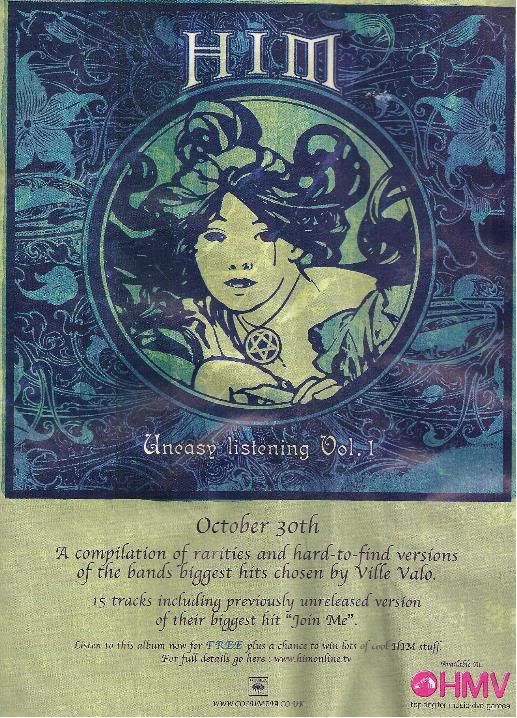


The images of the adverts shown above are all featured in mainstream music magazines easily available in high street stores. This is a typical media platform for band, single, album and tour promotions.
The sizes of the adverts vary, due to cost and design differences. However links can be established between all, providing guidelines of which we can base our own promotional advert.
Each advert typically includes a prominent image of the record it is selling, as shown in all but the Billy Talent advertisement, although a small thumbnail of the album can be seen. These images often feature the band or lead singer of the record, shown in the Evanescence and Betty Curse adverts. Although this is not a necessity, it would help recognition.
Easy recognition of the band being advertised is essential and achieved through images, but also through font. Each advertisement example features the font associated with the band, established from previous records and promotions. Maintaining this theme increases easy public recognition.
The band's record company logo is often included, however this is not always the case as none is visible in the Betty Curse advert.
The designs of the shown advertisements have provided us with examples of what makes a successful advertisement. We will include previously established themes of the band Paramore, including the font patterns of their album 'brand new eyes' and the subdued colour palette, whilst ensuring the purpose for the advertisement (CD/DVD digipak of their new single) is clear.

No comments:
Post a Comment