


By comparing the single and album coverwork of Paramore's released records, a link in style should be established.


For example, the album cover for RIOT! features scratchy writing in black and red/orange. When comparing this to their first single from this album, Misery Business, it is evident that the album cover has set a theme to be maintained; the scratchy font is again used on the Misery Business cover. This theme is continued once again on another single released from their RIOT! album, "That's what you get".
These two singles also feature the band, another theme that links the single artwork from this particular album, even though the album cover itself does not infact feature an image of the band.
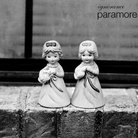
For their third album, Brand New Eyes, from which our chosen song 'Brick by boring brick' is from, we can see that the previous theme of the RIOT! album has been dropped and replaced with a far more minimalistic and sophisticated approach. The album features more subdued colours, and the scratchy capital letters of RIOT! have now been replaced by scripted lower case fonts. This album artwork suggests the band have calmed down and grown up from the in-your-face-sound of RIOT!.
This change is maintained through the artwork for their first single from Brand New Eyes, called 'Ignorance'. A simplistic greyscale palette is used with the same front used in Brand New Eyes. This contrasts with the artwork for Misery Business and That's What You Get, especially as the band's image is not featured on this cover.
As our chosen song is from the album Brand New Eyes, we shall comply to their newly established minimalistic and subdued theme when desiging the artwork for the CD/DVD digipak.

No comments:
Post a Comment