For the main location of our production we chose Oughtonhead Common, a local nature reserve. We chose this for its convenience, as it is easily accessible for our team, and also provides an open space without any industrial interference which is what we were aiming for. We believed it would provide an idyllic setting to present the story of the song and our music video, where our 'cartoon' props and fairytale would contrast against the world's nature.
For the other location, where our 'princess' is looking through the scrapbook, we have used my back garden- for convenience, but also to show to princess in an obviously separate location and therefore showing a difference in time- the princess is looking back on the events at the common from the comfort of her home.
We have used stereotypical characters when casting for the role of the prince and princess. We have used the actress Kayleigh Winter, who fits the 'blonde hair, blue eyes', vulnerable female category, suggesting the innocence and naivety which is needed for this particular part. The role of the prince will be played by Joe Lockyear, fitting the 'charming male' stereotype.
Both fit the age of our target audience, so our audience can relate to more to our characters and the relationship they present.
For the costumes used in our production, we used extra props such as the crown and the castle to imply fantasy and to present the idea of a prince and a princess, however for the actual clothes our characters wear we wanted to show a typical teenage style. For this our characters just wore plain clothes; Kayleigh wore blue jeans, black top and a scarf, a typical outfit for her and other female teenagers; Joe wore blue jeans and a grey cardigan, again a typical outfit for him and other male teenagers. The plain and 'normal' clothing of the teenagers juxtaposes against the crowns and other props of our 'fantasy' scenario.
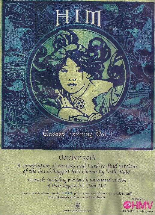
The images of the adverts shown above are all featured in mainstream music magazines easily available in high street stores. This is a typical media platform for band, single, album and tour promotions.
The sizes of the adverts vary, due to cost and design differences. However links can be established between all, providing guidelines of which we can base our own promotional advert.
Each advert typically includes a prominent image of the record it is selling, as shown in all but the Billy Talent advertisement, although a small thumbnail of the album can be seen. These images often feature the band or lead singer of the record, shown in the Evanescence and Betty Curse adverts. Although this is not a necessity, it would help recognition.
Easy recognition of the band being advertised is essential and achieved through images, but also through font. Each advertisement example features the font associated with the band, established from previous records and promotions. Maintaining this theme increases easy public recognition.
The band's record company logo is often included, however this is not always the case as none is visible in the Betty Curse advert.
The designs of the shown advertisements have provided us with examples of what makes a successful advertisement. We will include previously established themes of the band Paramore, including the font patterns of their album 'brand new eyes' and the subdued colour palette, whilst ensuring the purpose for the advertisement (CD/DVD digipak of their new single) is clear.
By comparing the single and album coverwork of Paramore's released records, a link in style should be established.
For example, the album cover for RIOT! features scratchy writing in black and red/orange. When comparing this to their first single from this album, Misery Business, it is evident that the album cover has set a theme to be maintained; the scratchy font is again used on the Misery Business cover. This theme is continued once again on another single released from their RIOT! album, "That's what you get".
These two singles also feature the band, another theme that links the single artwork from this particular album, even though the album cover itself does not infact feature an image of the band.
For their third album, Brand New Eyes, from which our chosen song 'Brick by boring brick' is from, we can see that the previous theme of the RIOT! album has been dropped and replaced with a far more minimalistic and sophisticated approach. The album features more subdued colours, and the scratchy capital letters of RIOT! have now been replaced by scripted lower case fonts. This album artwork suggests the band have calmed down and grown up from the in-your-face-sound of RIOT!.
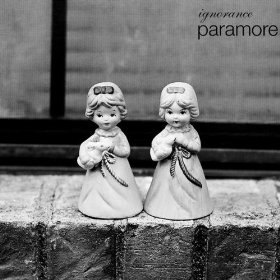
This change is maintained through the artwork for their first single from Brand New Eyes, called 'Ignorance'. A simplistic greyscale palette is used with the same front used in Brand New Eyes. This contrasts with the artwork for Misery Business and That's What You Get, especially as the band's image is not featured on this cover.
As our chosen song is from the album Brand New Eyes, we shall comply to their newly established minimalistic and subdued theme when desiging the artwork for the CD/DVD digipak.
From existing music videos we can see that the forms and conventions used within them vary greatly. Therefore by challenging one aspect of a particular video we will unavoidably conform to that of another.
We will be challenging the conventions of Paramore’s existing music videos, as our production will not feature the band themselves. However, we will mirror the song’s lyrics in our story – a form that is evident to some extent in all their videos.
Gaining inspiration from music videos including Oren Lavie’s Her Morning Elegance and Paramore’s Hallelujah, we will use our own artwork throughout the video as well as stop-motion techniques and the use of a scrapbook to bring our story to an end.
In order to gain an idea oh how the band and their songs are presented in music videos, I have researched some of their previous music videos.
Misery Business – The music video for Misery Business begins energetically, showing shots of the band, cutting quickly between angles and scenes. The location begins with the band in a room covered in scribbled “Riot!” writing over the walls, the name of the bands second album from which the song is from and the video is evidently trying to promote. The band are all wearing black and bright red/orange colours, a theme that they have established as a band mainly due to the lead singer’s vibrant hair colour. The editing matches the pace of the song, and focuses on the lead singer as she mimes along to the words.
The video swaps between the bands’ performance and a storyline of a stereotypical high school, with a “plastic” girl bullying other students. The setting of a high school and connected story is relevant to their majorital fan base of American teenagers as they will be able to relate to the video.
The video features the frequent use of vibrant colours throughout, emphasising the upbeat quality of the song.
The plot of the video draws to a close as the band confront the high school girl and ruin her appearance by smudging her make-up etc. This is a noticeable reference to the song’s lyrics involving taking an assumingly similar girl away from her aloof and unkind behaviour and enjoying it: “it was never my intention to brag / to steal it all away from you now / but god it feels so good”.
Hallelujah – Hallelujah opens showing a scrapbook featuring (similarly to Misery Business) the now trademark black and orange scribble writing on their Riot! album, with the words “Paramore” and “riot!”, so the audience is immediately aware of what to expect from the video and who it’s by.
The video goes through the scrapbook, as the camera “zooms in” and pans through picture to picture, each featuring a video clip of live shows and the band backstage. The live shows are of the band playing the song Hallelujah, and are in sync with the music.
Throughout, the scratchy “Riot!” font is featured, with lyrics from the song.
The video appears to represent the band’s rise to fame, focusing on the themes (Riot!, scratchy font, red and black) that have been established in connected with the band on their journey.
Ignorance – The music video for ignorance focuses on the band, as has been the case for Misery Business and Hallelujah. The Riot! font that was prominent in these videos, however, is not present in this video as this single is from their new album, and evidently this theme was not to be continued. However, Hayley Williams still has her trademark orange hair colour.
The video shows the band in a cramped, dark room, playing and singing along to the song. All dressed in black, the only colour and light is Hayley’s hair and a light bulb she swings around with. The song lyrics are directed by Hayley towards her band mates, and the light bulb therefore could be representative of bringing to light what band life is really like as she illuminates each member in turn. The confined space in which it is filmed match the lyric’s emotions of feeling trapped or claustrophobic within the band.
AS ever, the editing pace is energetic in conjunction with the song tempo, with quick jump cuts between shots and angles, as well as alarming flashing lights. Throughout the video, as again with their other videos, the focus is on the lead singer and female of the band.
It is apparent that the recurring theme to Paramore music videos is a main focus on the band themselves – something we are unable to do. However it is also shown that each song has a relatively predictable video accompanying it, relating to the lyrics and pace of each song effectively. For our production we can focus on the story of the lyrics and retain similar editing styles and techniques of the existing videos, as well as unconventional ideas such as the scrapbook in Hallelujah.
The target audience for our music video production will be that of the band, Paramore. The fan base for Paramore are predominantly American teenagers, however the band are becoming increasingly popular worldwide including the UK, often frequenting the play lists for mainstream radio stations such as BBC Radio One. Because of this expanding fan base and the nature of music videos, we feel we can target our production to a widespread audience and even create a larger fan base by capturing the attention of some who would not usually listen to this band or genre.
We will be predominantly targeting the 13-21 age group, both male and female, as this is an age group most susceptible to viewing our production and media area, and also who relate to the band, lyrics and songs.
The song we have chosen to produce our media package for is Brick by Boring Brick by Paramore, a five-piece alternative rock band from Franklin, Tennessee.
The lyrics (which can be read here ) of the song present the idea of the contrasting and conflicting worlds of fantasy and reality, an idea we have chosen to focus on in a literal sense when we produce our music video. We wish to present a largely literal representation of the lyrics and the tale they tell of a girl, placed in a scenario similar to that of a fairytale, refusing to live in real life until it's too late. The style of music video that we wish to create will allow us to showcase a range of techniques, including artwork and animation. As the song does not already have an official music video, we feel this allows us to have sufficient creative vision for the video that won't affected by a preconceived idea of what it 'should' be like, as may have happened with another song which already has one.
As part of a promotion package, music companies include CD covers for singles and albums. Even digitally released tracks often have artwork to accompany them. I will be creating a CD cover for a track as well as a music video, and have researched existing products.
As an example I researched Duffy's album and single covers. Evidently a theme has been established in the marketing to match and maintain her 60s-style appearance a vocals. The 'Duffy' signature has been included on all covers as well as a black and white image of her to ensure the audience easily recognises the CD to be hers. The same font is also used on singles covers to maintain easy recognition.
These covers echo the style of Duffy's videos, emphasising the way music is presented as an easily accessible and recognisable package. The 60s/modern style of Duffy's appearance and vocals in maintained through the CD covers and also her videos, such as Mercy and Stepping Stone (shown below).
It is hard to pinpoint exact conventions of music videos as techniques and preferences are so varied; music videos can be shot using live action or animation, for example, and can show narrative or abstract content.
Lyrics can be used to establish the general mood and feeling of the subject, and tempo often drives the pace of editing. For example, The Quiet Things That No One Ever Knows by Brand New has a majoritally fast pace, to which the editing of the music video matches using fast cuts between the scenes of the story and also the band singing, with various angles used within these scenes. As the song slows, so does the editing pace. As quite a dark, alternative rock band, the genre of the band and the reflective lyrics of the song set the tone for the video which is quite dark and alarming involving the death of a young man's girlfriend. Although the video does not directly mirror the actions or story of the lyrics, the lighting and subject of the video matches the intended atmosphere created by the music.
The genre of the music is reflected in music videos, for example Girlfriend by Avril Lavigne is that of punk princess girl power and the video reflects this as the characters fight each other over a boy.
The bright colours used in Avril Lavigne's video implement happiness and emphasise the mocking style of the video, whilst the frequent use of bright pink emphasises the "girl power" aspect of this genre, with the pink banners mixed with "punk" symbols to also portray rebellion and dismissal of expectations - all ideas Avirl Lavigne's predominantly female and young teenage audience will relate to and engage with.
Another convention that often appears in music videos is the use of choreographed dance routines, an example demonstrated in Beyonce's Single Ladies video. This video also demonstrates the frequent objectification of women often found in all visual media, including music videos, referring to the way she and her dances are dressed. However, the strict black and white colour code of the video portrays sophistication, and the song subject and confident routine also shows female independence and security; a relatively modern concept in gender equality that is now evident in all aspects of life.
Oren Lavie's music video for Her Morning Elegance is made entirely using the stop-motion technique. The actors stay on the bed and objects are moved around them to create the illusion of movement, for example pillow "clouds" move across the actress' head as she apparently "walks" down pillow stairs. The characters do not mime along to the words; however their actions often mirror the lyrics, for example as she sits "on a train". The video creates a dream-like quality and complements the music's lyrics and pace, and is overall fascinating to watch as conventional filming techniques are not used - the camera stays in the same place for the entire video and instead the objects are moved. It took roughly 3225 still photos and two days to complete the entire video.
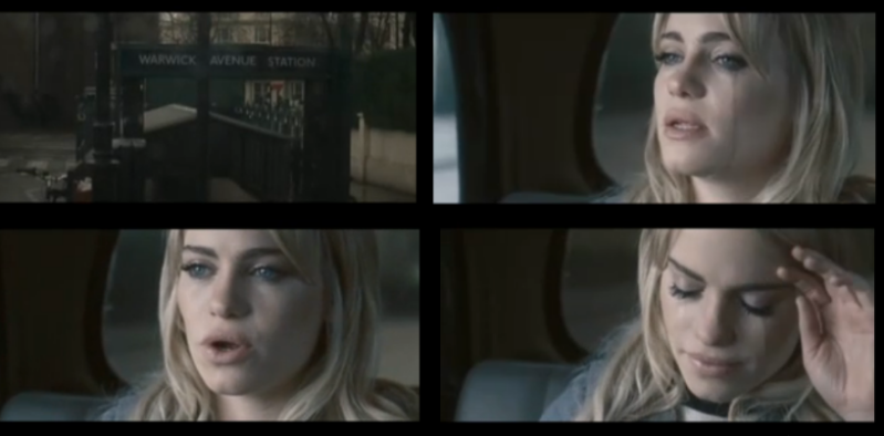
The music video for Warwick Avenue by Duffy is simply directed, showing only a constant middle close up shot the singer (Duffy) miming along to the words of the song in the back of a taxi. Despite - and because of - this simplicity, it effectively portrays the emotion of the song. As Duffy begins to cry whilst singing, and paired with the sombre colours and previously shown rain outside, the audience is aware of the raw feelings the song contains and can sympathise with her, or relate to a situation they themselves have been in.
This is an example of a common style of music video - the band or singer is the main focus of the video and they mime along to the words.
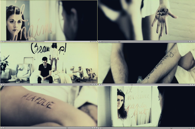
The music video for What Sarah Said by Death Cab For Cutie involves a wordless story surrounding two characters, male and female. The characters' actions do not directly relate to a literal translation of the song lyrics; however the sombre mood of the music is matched in the atmosphere of the video. The woman in the video writes messages in French throughout, apparently in an attempt to gain the attention of the man. The messages translate; "He loves me", "a little?", "a lot!", "passionately", "to madness", "or not at all" which is the French version of the traditional "he loves me, he loves me not" which can be never-ending. This theme of recurrence is maintained as the song finishes, only to rewind and play again from the beginning as the characters start over from the beginning as well.
The main theme of the lyrics of the song is "love is watching someone die / so who's going to watch you die" which could allow for the interpretation that the evidently disfunctional relationship of the man and woman in the video is a presentation of watching each other die through their love. The white clothes of the woman have connotations of innocence, peace and purity, but could also suggest she is a ghost. This shows complete contrast with the black clothing of the man, with connotations of death, darkness, fear and rebellion, emphasising the abnormality and difficulty of their relationship, whilst his chain smoking could represent the addiction of love and how they can't break away from each other even if it is killing them. The constant flickering between camera angles and shots of both characters suggest a tortured existance for them, and the repetition or haunting of this relationship is emphasised as once finished, the video starts all over again.
This video presents a representation of the song, open to the audience for interpretation as a story rather than the literal miming and mirrored story of the lyrics that is often seen in music videos.
"A music video is a short film or video that accompanies a complete piece of music/song. Modern music videos are primarily made and used as a marketing device intended to promote the sale of music recordings. Although the origins of music videos go back much further, they came into their own in the 1980s, when MTV based their format around the medium, and later with the launch of VH1. The term "music video" first came into popular usage in the early 1980s. Prior to that time, these works were described by various terms including "filmed insert", "promotional (promo) film", "promotional (promo) clip" or "film clip". In Chinese entertainment, music videos are simply known as MTVs because the network was responsible for bringing music videos to its popularity. Music videos use a wide range of styles of film making techniques, including animation, live action filming, documentaries, and non-narrative approaches such as abstract film. Some music videos blend different styles, such as animation and live action."
Task: A promotion package for the release of an album, to include a music promo video, together with two of the following three options: a website homepage for the band, a cover for its release as part of a digipak (CD/DVD package), a magazine advertisement for the digipack (CD/DVD package)
 For the main location of our production we chose Oughtonhead Common, a local nature reserve. We chose this for its convenience, as it is easily accessible for our team, and also provides an open space without any industrial interference which is what we were aiming for. We believed it would provide an idyllic setting to present the story of the song and our music video, where our 'cartoon' props and fairytale would contrast against the world's nature.